
Phase 1: Concept Sketch | This was one of 4 original concepts I pitched for an "angy chameleon" for the book's cover. The Art Director liked the idea of the boxing chameleon but wanted to see two facing off instead of just one.

Phase Two: Rough Sketches | Here is the revised cover concept showing two chameleons facing off. This was approved as is so it was off to the drawing and rough color stage.

Phase Three: Proposed Color | This was the original proposed artwork for the cover. The publisher didn't like the yellow and asked to add a background.
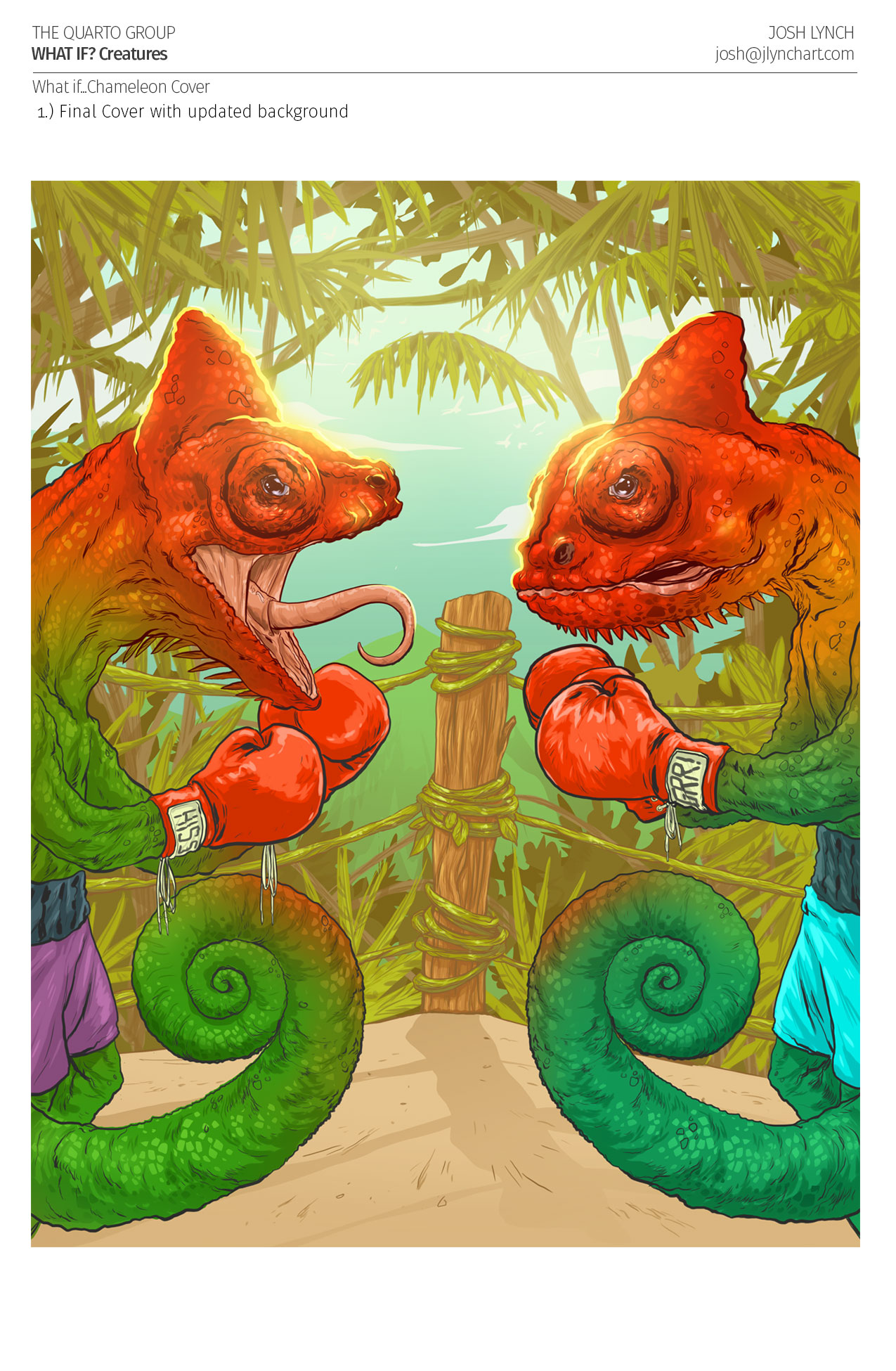
Phase Four: Final Illustration | Here is the finished cover with the updated background. This was ultimately rejected for the cover, but was later revisited as a two page spread for the interior. The AD requested to flesh out the background further to use it as a two page spread. Also note that in the next phase the title of the book changed.

Phase Five: Repurposed Art | This is the final approved two page spread featured on the interior of the book. I was sad it didn't make the cover but glad it was used in the end. The input from the AD and publisher definitely made for a stronger finished product.